


Videos
Disinformation Without Deception: When Russian Strategic Narratives Resonate with West African Audiences
![]()

A Report from the Shorenstein Center’s Single Subject News Engagement Project
Email is a crucial vehicle for media companies to generate reader revenue, yet the ways we talk about and measure email have not changed for almost two decades. Flawed, static measures can distract from success and lead to misguided strategies, crippling the development of new products. Using open source techniques from other fields, data scientists are able to provide a more complete picture of an organization’s readers and viewers. The Shorenstein Center Notebooks (written in Python and available on GitHub as a free, open-source tool) take a first step at demonstrating new ways to analyze list composition and performance in order to help editors and publishers ask and answer more nuanced questions.
The open source community has a lot in common with journalism: transparency, collaboration, etc. Although journalism often uses data science tools, very little has been published about how to use data science to analyze audience and grow reach. Most single source newsrooms are not large enough to support a dedicated data science team, but all face similar challenges of figuring out how to sort through their mounds of data to gain crucial audience insights. Data analysis holds the key to building revenue sustainability—the bedrock issue for any enterprise—in our increasingly digital world. The Shorenstein Center Notebooks represent a change in mindset toward creating a freely available, shared knowledge base.
2 | Who Is Your Email Audience?
2.1 | Inconsistently Labeled and Defined Email Metrics
2.2 | Nuances Affecting Deliverability and Measurement Specific to Email
3 | The Shorenstein Center Notebooks
A | Notebook 1: Moving Beyond List Size to Explore List Composition
Notebook 1 Section 3.1: Basic List Composition
Notebook 1 Section 3.2: List Composition over Time
Notebook 1 Section 3.3: Subscriber (In)Activity
Notebook 1 Section 3.4: Subscriber Engagement Distributions
Notebook 1 Section 3.5: Investigating Churn
B | Notebook 2 : A Deeper Look at Audience Engagement
Notebook 2 Section 3.1: Engagement by Individual User
Notebook 2 Section 3.2: Last Active by Individual User
Notebook 2 Section 3.3: Two Dimensional Distributions
Notebook 2 Section 3.4: Time on List for Unsubscribed Users
The great challenge of our current media landscape is capturing and retaining user attention. A proliferation of devices, media outlets, channels and opportunities fragment user attention, while also making it more difficult to measure. Media monetizes user attention, and so the fragmentation of attention has profound consequences for the news media’s business model.
Building online audience—and consequently reliable digital revenue—requires creating a repeat “habit of news” with online readers and viewers. The single most reliable digital channel for building a “habit of news” is email. Unlike many other digital channels, email allows publishers to measure repeat, sustained reader attention. An email is, by definition, a unique identifier. You can track multiple opens over time, and build behavioral models to maximize your share of a reader’s attention—companies like Sailthru and ExactTarget are designed specifically to optimize email marketing programs around individual user behavior.
A strange thing has happened over the last few years even as messaging platforms have proliferated on mobile phones: email has endured. Among all the potential uses of smartphones, reading and writing email is the third most popular activity after text messaging and web surfing—it even tops listening to music. Exact statistics on mobile email reading behavior vary based on audience and type of email, but multiple studies show more than half of email opens are on mobile devices.
In this landscape, email is a crucial vehicle to drive major revenue streams. While ad units in email tend to have higher CPMs (cost per thousands), email is a primary source for reader revenue through subscription or membership programs. Readers who sign up for the New York Times’ email newsletters are twice as likely to become subscribers.[1]
Email newsletters are now the mechanism for engaging and retaining readers and converting an audience into paying subscribers or moving them toward other sources of monetization. For the biggest outlets, that digital-only audience runs into the seven figures: 2 million at The New York Times; 1 million at The Washington Post.[2] “Email is such a powerful delivery tool because it’s a stream people already check,” says Ben Thompson, founder and author of the popular tech newsletter Stratechery. “To be invited into a place where people live—and to know you won’t be filtered by an algorithm—is a very powerful thing.”[3] Swedish journalist Charlotte Fagerlund adds: “Emails have got quite a lot of different functions. They are an effective way of making people continue to read after they have started paying, a way to drag in people, and they are, of course, a very effective way to make money from ads.”[4]
Media companies use email to push readers in massive numbers to websites, convert their readers into paid subscribers and then maybe even purchasers of related events and products. The benefits don’t stop there—since emails have high open rates, they command expensive ad placement, resulting in high CPM rates if done correctly. Most importantly, email forms the primary channel for the performance funnel[5]: acquiring audience, converting casual audience members into engaged readers, and eventually converting engaged readers into revenue-generating engaged readers. By focusing on acquisition of readers’ email addresses and by fostering longer-term engagement, media companies can grow their earned revenue by using email to explore the viability of new revenue sources.
The key is knowing how to leverage and manage the email newsletter correctly. Understanding your audience and building an exceptional editorial product is the first challenge of successful email execution; that is not the focus of this paper. The email newsletter cannot be a successful mechanism for sustainability with a focus on excellent content alone. It also requires knowing how to track and interpret the new goldmine of data that comes with it, responding appropriately based on what you learn.
We know that email data can be used to: 1) combine various data sources, creating richer data sets, 2) analyze audience behavior over time to increase engagement (and consequently increase revenue), and 3) identify target audiences and test new products. Email performance data is the gateway to understanding a range of characteristics about your current readership and opportunities for growth. Yet, a far too common mistake is an over-reliance on open and click rates alone—these numbers are just the tip of the iceberg. We must shift to effectively leveraging email data—data every publisher owns—for a deeper analysis of online audiences.
News organizations are slow to this game. Other digital communicators shifted years ago to this deeper level of analysis. SumOfUs, a global advocacy organization, created waves in digital advocacy when they shared their own new metric to track depth: MeRA (Members Returning for Action), or the number of unique members who have taken an action other than their first one. MobLab, a network for social change campaigns, published a series on this subject starting in 2013. In 2015, MobLab and the Citizen Engagement Lab produced the report “Beyond Vanity Metrics: Toward a Better Measure of Member Engagement” in the Stanford Social Innovation Review. It’s time for media companies to catch up.
The purpose of this paper is to introduce key methods of email data analysis and argue for new metrics that measure audience engagement. A more sophisticated analysis of email analytics is crucial to understanding audience behavior and building a “habit of news.” In section 2, we review some of the challenges facing measurement and analytics. In section 3, we make the case for new measures for email performance. Finally, in section 4, we introduce the accompanying “Shorenstein Center Notebooks”—written in Python and available on GitHub as a free, open-source tool—to show how these measures work. The notebooks are a jumping off point. Contributions are welcome.
News media outlets are rolling out email newsletters at a rapid pace, with high hopes of turning their new digital audience into a sustainable source of revenue. As the field grows more crowded, there’s a scarcity of authoritative research on email performance. A central problem is the inconsistent labels and definitions applied to email metrics; as we will see below, an open rate is not always an open rate. This is further complicated by the nuances affecting deliverability and measurement specific to email and the challenges associated with the limitations of traditional email performance measures.
The media have widely adopted established labels for email metrics: list size, open rate and click rate. Strategies are built around these numbers while products and campaigns are evaluated by them. The computation behind these summary statistics varies from platform to platform; many email service providers use different definitions. There is an urgent need to create a shared understanding about how these measures are labeled and calculated.
The standard “open rate” metric tracks the percentage of users who have opened an email. Is the percentage relative to the number of emails sent, or only those successfully delivered? How is “successfully delivered” defined? And what if a recipient opens the same message twice, or forwards the email—does that impact open rate? And if so, does that mean theoretically open rates can be higher than 100 percent?
Answers to these questions have a great impact on the interpretation of “open rate” metrics. Some are straightforward answers—on most platforms, open rates are defined as a percentage of emails delivered, and it is widely accepted that emails sent but not successfully delivered do not factor into open rate computation. But other questions, such as the impact of double opens by a single user on open rate, are too often vaguely expressed as “open rate.”
Most email service providers today define open rates as the percentage of users that open delivered emails (we call these “unique open rates”), but some providers compute it as the number of times delivered emails are opened, allowing multiple opens by a single recipient or forwards to be factored in (we call these “total open rates”). Email service providers often fail to clearly label and communicate whether the open rates prominently displayed on their dashboard are total or unique open rates.
This lack of standardization becomes a problem when we seek to contextualize our performance through industry benchmarks. By comparing two rates that are referred to by the same name, but have been computed differently, we can end up under- or overestimating our own performance. Unique open rates are more valuable for managers of editorial email products, whereas advertisers focus on total opens—but this crucial difference is rarely communicated widely.
The ambiguity of “open rate” (rather than specifying unique open rate vs. total open rate) is just one example of how traditional email analytics can be misleading, and illustrates the need for an industry-wide clarification of reporting standards.
The table below presents the nuances of how three commonly used email service providers label, define, calculate and display open rate and click rate metrics. While this is a limited data sample, it is indicative of a wider industry challenge created by a lack of consistency when discussing and displaying metrics.
Open Rates: Comparison of Email Service Providers
“Open rate” often refers to “unique open rate,” although that is usually not specified. There is a temptation to report the total open rate in certain situations because it is larger, such as media articles, and also refer to it as “open rate.”
| MailChimp | Constant Contact | Sailthru |
| Label: “Opens” or “Open Rate” | Label: “Open Rate” | Label: “Est Opens” |
| Definition: Percentage of successfully delivered campaigns that registered as an open. [source]
|
Definition: An email’s open rate is the percentage of recipients who opened your email compared to how many contacts were sent the email. The percentage of opens is calculated by dividing the number of unique opens by the number of emails sent excluding the number of bounces. [source]
|
Definition: Confirmed Opens (number of users who opened the email with images turned on or clicked through email with images turned off), plus the estimation of users who opened with images turned off but did not click. (This estimate is based on the ratio of opens to clicks for those users with images enabled. That ratio is then multiplied by the total number of users who clicked.) |
| Calculation:
|
Calculation:
|
Calculation:
Not provided. |
| Dashboard Display: Only Unique Open Rate is prominently displayed and labeled as “Open Rate.” “Total Opens” is reported as the number of total opens, but total open rate is not calculated as a percentage.
|
Dashboard Display: Unique Open Rate is prominently displayed and labeled as “Open Rate.” “All Opens” is a sort feature and is not prominently reported but can be used to calculate total open rate by hand.
|
Dashboard Display: Unique Open Rate is prominently displayed and labeled as “Campaign Open Rate,” displayed below Estimated Opens and calculated as Est Opens/volume delivered. Total Opens are not reported or calculated on the main dashboard. A separate dashboard displays User Open Rates. |
| Reported Average “Open” for Media/Publishing:
22.14% [source] |
Reported Average “Open Rate All” for Publishing:
13.28% [source] |
Benchmark report not provided. |
Click Rates: Comparison of Email Service Providers
“Click rate” sometimes but not always refers to click-through-rate or “unique click rate.”
| MailChimp | Constant Contact | Sailthru |
| Label: “Clicks” or “Click Rate” | Label: “Clicks” or “Click Through Rate” | Label: “Clicks”
|
| Definition: Percentage of successfully delivered campaigns that registered a click. [source]
|
Definition: The Click Through Rate is a percentage that shows the number of times links are clicked in an email by a contact. Multiple clicks by the same contact are not factored in. We base your Click Through Rate on contacts that opened your emails so that those who didn’t open it don’t skew your results.
Note: We don’t track links to Constant Contact or Paypal. If you include links to these sites in your email, you won’t see their results in this report. [source] |
Definition: For users on the list, the percentage of campaign sends that result in at least one email click. Note that mass mailings typically have some number of undeliverable messages (bounces), so the percentage of clicks is typically higher when it is based on your number of delivered emails rather than sends. [source]
|
| Calculation:
|
Calculation:
*Constant Contact does not include clicks from Constant Contact or PayPal links in “Unique Clicks” |
Calculation:
Not provided. |
| Dashboard Display:
“Click rate” is prominently displayed as calculated above. Additionally, “Clicks per unique opens” and “total clicks” are presented.
|
Dashboard Display:
“Click Through Rate” is presented as a number and percentage. Total Clicks is not included in the dashboard.
|
Dashboard Display:
Unique Click Rate is prominently displayed and labeled as “Clicks.” Total Clicks are displayed on the main dashboard. “Click Through Rate” is labeled “Clicks / Opens” on the main dashboard. |
| Reported Average “Click” for Media/Publishing:
4.70% [source] |
Reported Average “Clicks (Click-Through Rate)” for Publishing:
13.07% [source] |
Benchmark report not provided. |
It is essential to have a clear understanding of the calculations behind the metrics provided by your email service provider. When various industry reports are published, check the definitions and methodology to ensure that it is an appropriate comparison. For example, MailChimp’s reported “click” rate is much lower than Constant Contact’s “Clicks (Click-Through Rate)” because ultimately they are based on different calculations. With better control of overall data, a more accurate version of the statistics can be calculated.
Email is the most accessible form of online communication. When you send emails to your list, in theory you can trust your emails will arrive in your readers’ inboxes. With social media, outgoing messages to your audience (posts or tweets) are manipulated by an outside platform’s mercurial, black-box algorithms.
While this is largely true, it is important to understand the gray areas of email. Deliverability (making it to the inbox), effective deliverability (readers see your email in their inbox), and measurability (extent to which reader opens or clicks are recorded accurately) bring a degree of uncertainty to some measures of performance.
Deliverability: How successful are your emails at reaching the inboxes of your email list subscribers? Hitting send on an email without an error message in return does not guarantee successful deliverability. A number of factors can impact deliverability, including:
Effective Deliverability: Do readers see your email in their inbox? Seemingly minor changes to email client products, such as Google priority inbox, carry vast implications and can have outsized effects.
[1] An IP address (short for “Internet Protocol address”) is used to identify computers on the internet. It functions almost like a physical address. IP reputation can be used to tell if a certain IP Address is responsible for sending spam or unwanted bulk email.
For many years, audience behavior on email has been analyzed primarily on the basis of three measures: list size, opens and clicks. In order to build deeper understanding of audience behavior and find new ways to grow revenue, we need to examine these metrics, and create new metrics—specific to media—where traditional metrics fall short. Without more sophisticated measures, media outlets end up chasing numbers that won’t improve performance.
There is no doubt that these measures—especially list size—are important and drive the underlying dynamics of a traditional performance funnel. These metrics can be useful as a baseline in building your audience acquisition and engagement funnel. But when the only metrics used to measure success are list size, open rate and click rate, a clear view of performance is obscured.
List growth and size of list are the most common measures of success. A simple, straightforward number is useful to assess trends, but provides very little insight into the quality of the list or the list’s engagement. The math of the performance funnel puts pressure on large list growth and can lead to padded and manipulated list size numbers. (Similarly, open rates can be manipulated by using especially enticing subject lines, but this may come at the cost of reader trust and long term engagement.) Better measures of list size are engaged after sign up—do users read the first few emails you send them, or do they start ignoring you immediately? What percentage of the list is passive, not opening emails and not even bothering to unsubscribe? Simply measuring list size makes it difficult to assess: Are we targeting the right users? Is our product delivering value? Is our welcome series working?
Another common challenge of focusing on list size is the connotation that unsubscribes equals failure. Unsubscribes are not necessarily bad—they provide helpful indicators about your audience and content strategy. Are you targeting and acquiring the wrong audience? Do you need a better welcome series? Is a certain group of readers turned off by your content? Are your emails too frequent?
Traditional analytics—list size, opens and clicks—provide a high level snapshot, but they do not provide insights on the underlying drivers behind those metrics.
Having argued for the essential value of email, and demonstrated the shortcomings of traditional measures of email performance, we are introducing the Shorenstein Center Notebooks (written in Python and available on GitHub) to provide examples of new methods of assessing list health, both in terms of composition and engagement. While reviewing the notebooks and their outputs, it is important to keep in mind a few disclaimers:
The Shorenstein Center Notebooks: Overview
The Shorenstein Center Notebooks—available at https://github.com/ShorensteinCenter—are two jupyter notebooks that provide example code for:
Python and pandas are used for data analysis and manipulation. Matplotlib and seaborn are used for data visualization.
The notebook code is fully available on GitHub and are built on top of open source libraries, making all calculations and manipulations fully transparent. The example code provided is for the MailChimp API, but can be adapted to run on any modern email service provider that allows raw data to be pulled from an API. Additionally, other file types, such as json, excel, csv, etc., can be imported into the notebooks if desired. Various email service providers label and format data differently. As long as raw audience data can be collected, updating the Shorenstein Center Notebooks for compatibility beyond MailChimp requires relatively trivial changes to achieve the same outcomes.
Each notebook is divided into three sections:
The section numbers and subtitles for the Shorenstein Center Notebooks referenced in this research guide mirror the section numbers and titles on Github.
After the notebook is finished running, an output folder containing results from your list will appear in the location where you ran the notebook.
Below are sample results from each notebook. These examples are intended to help you interpret the general meaning of your notebook outputs. Additional research is necessary in order to establish statistically significant baselines for the new forms of analysis presented.
This first notebook examines the composition of your email list as a whole, and slices the data to reveal new insights and areas of inquiry. Shifting the focus from aggregate list size to list composition means examining the current state of all email addresses acquired over the lifetime of the list, rather than a snapshot of the current moment’s total number of subscribers. Analyzing data surrounding the dates emails were acquired and other characteristics within an email address’ lifecycle allows for new insights about acquisition and the lifecycle of a subscriber come into view.
The Basic List Composition records the total number of unique email addresses contained in the entire list and breaks them into percentages. In this case, the entire list refers to all email addresses ever acquired, both currently and formerly subscribed. MailChimp has four possible values for list member status:
Lists with double opt in enabled at any point in the past may have pending subscribers, even if the list currently has single opt in. Below are sample results from the different kinds of lists, offered to show potential differences in interpreting your results.
Figure 1a. List Composition, Mature List
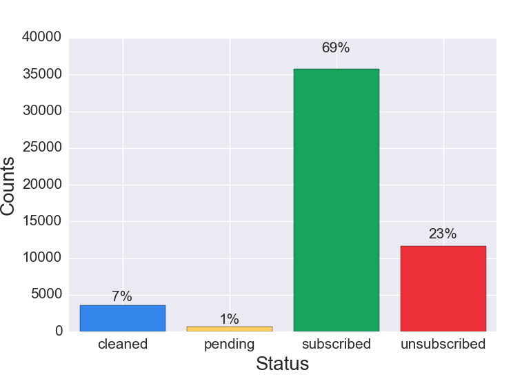
Figure 1a Discussion: Preliminary research suggests that for mature lists the largest cohort is subscribed. The second largest cohort is unsubscribed. Cleaned addresses typically compose the smallest cohorts. The proportion of pending subscribers varies based on list acquisition strategies—single vs. double opt in.
Figure 1b. List Composition, New List (Less Than One Year Old)
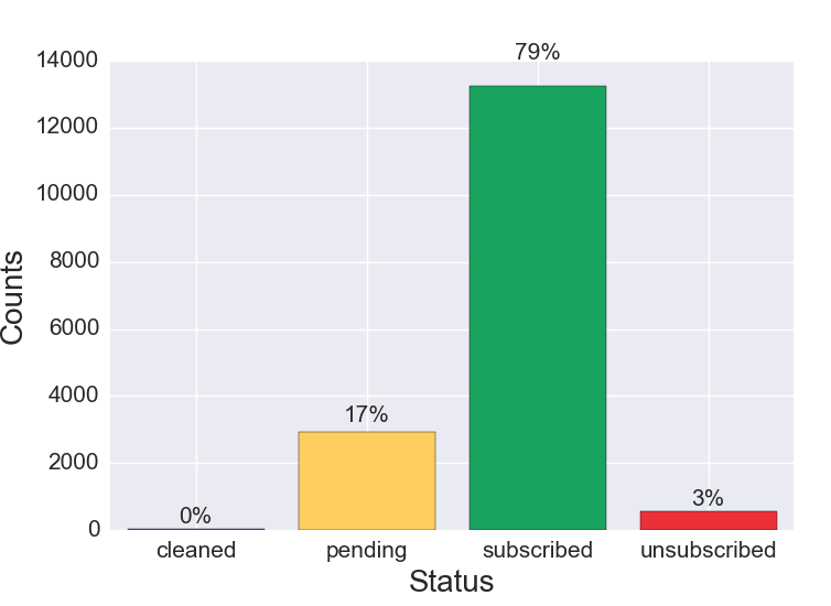
Figure 1b Discussion: Compared to email lists older than one year, newer lists usually have a larger proportion of subscribers. The unsubscribed and cleaned cohorts are smaller than on a mature list because churn has not had the opportunity to build up over time. Churn refers to the percentage of subscribers who unsubscribe, become inactive and need to be removed, or are cleaned due to bouncing in a given period of time.
Figure 1c. List Composition, Surprising List
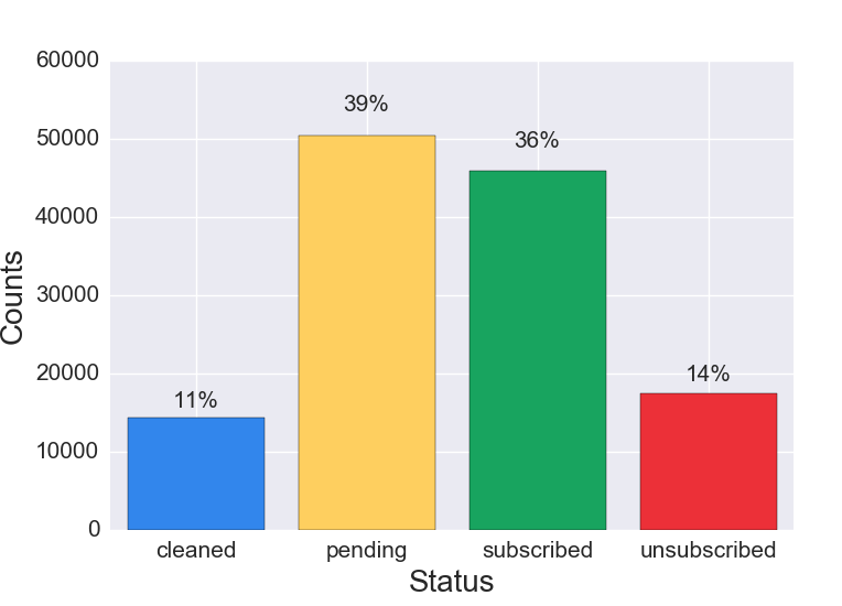
Figure 1c Discussion: A list composition where the largest proportion of the list is pending requires further analysis. This can be caused by a number of factors, including:
Another segment to review is the cleaned cohort. Our initial research suggests that a proportion of 15% cleaned or above is high enough to warrant further investigation. As explained in the discussion of Figure 2d, older lists are more likely to have a higher proportion of cleaned emails.
Summary statistics in Section 3.2 are helpful to begin painting a picture of list composition, but they do not provide any insights regarding your list composition by time joined. The analysis in this section plots the current status of all unique email records by time joined—the time the user record was created. Taking this approach begins to uncover audience trends throughout the lifetime of the list.
In the below examples, the data is broken into four cohorts (subscribed, unsubscribed, pending and cleaned) with the following detail:
Figure 2a. List Composition by Date Joined, Expected Pattern
Figure 2a Discussion: The visualization can be read as follows: For all new user records on the list created September 2014, currently 0.6 or 60% are still subscribed, .25 or 25% are unsubscribed, and 0.15 or 15% are pending. Viewing changes in the proportions of member status over time allows you to gain a picture of the dynamics of your list, and perceive trends or anomalies. This example shows an “expected pattern,” where subscribed is the largest proportion, the unsubscribe line never surpasses the subscribed line, and the proportion of pending addresses remains below 0.2 or 20%.
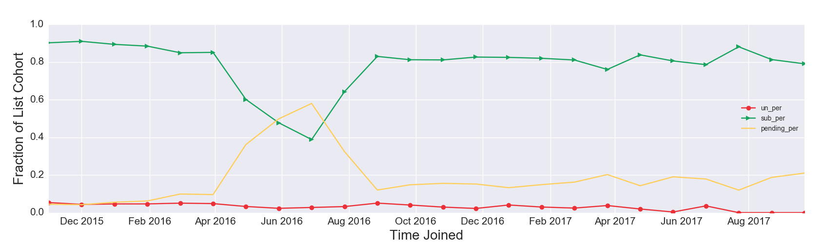
Figure 2b. List Composition by Date Joined, One-time Aberration
Figure 2b Discussion: Over the lifetime of the list, the largest fraction is subscribed, except for one time period. An unexpected aberration occurred from April 2016 to September 2016; the fraction of pending subscribers at one point rises above the fraction of subscribers—a cause for further investigation. Keep in mind these are current states plotted by the time user records were created. Of everyone who joined the list in June 2016, a higher proportion of user records are currently pending then subscribed. See Figure 1c Discussion for possible explanations. It is possible to find legitimate subscribers stuck in pending. In the U.S. you can legally add these individuals as subscribers to your list, but getting professional advice is recommended to avoid the nightmarish scenario of being blacklisted. One possible approach is sending additional emails requesting that users confirm subscription.
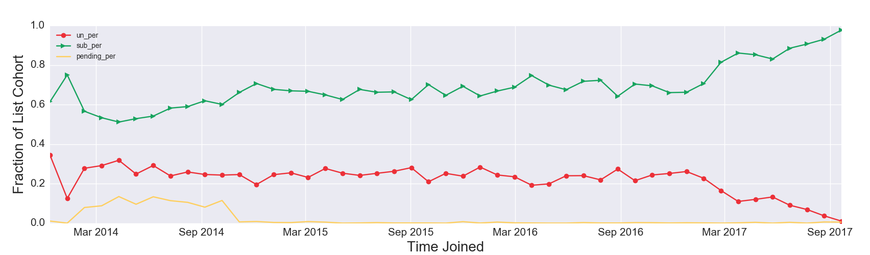
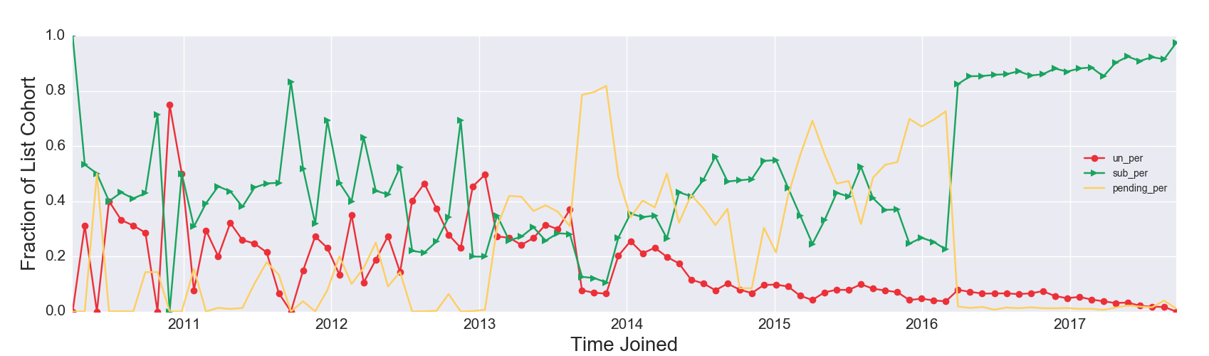
Figure 2c. List Composition by Time Joined, Atypical Pattern
 View larger.
Figure 2c Discussion: Although atypical, this example can be extremely informative about the longer term outcome of acquisition efforts. The proportion of unsubscribed users (the solid red line with circles) exceeds the proportion of subscribed users (the solid green line with triangles) multiple times throughout the life of the list: in early 2011, late 2012, early 2013 and mid 2013. It is tempting to think the subscriber list shrank during those times, but that interpretation of the visualization is flawed. For all emails acquired on that date, currently a greater fraction are unsubscribed than subscribed. Importantly, the unsubscribes may have happened over time. It is possible that specific acquisition campaigns could have high rates of retention failure but would still attract a core group of high-value subscribers from a revenue perspective.
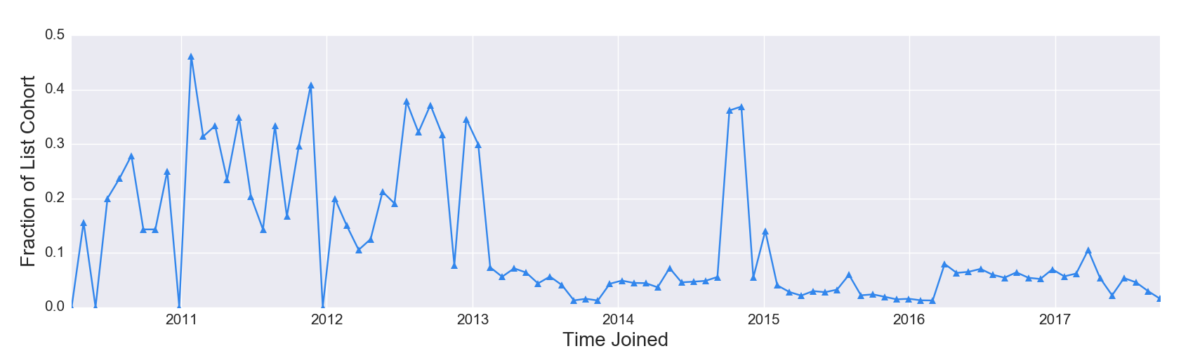
Figure 2d. Proportion of List Cleaned by Time Joined, Mature List
Figure 2d Discussion: Figure 2d visualizes the same list as Figure 2c, and represents a case where cleaned emails could have been plotted on the same y axis as the three other possible states. Why? Longtime subscribers have a higher probability of being cleaned than newer subscribers. Emails have a “shelf life.” We expect emails acquired prior to 2013 to have a higher proportion of cleaned emails today than emails acquired in the last twelve months. Some of the spikes in the fraction of cleaned readers are concerning, such as in late 2014, where 40% of all emails acquired at that time have been cleaned. These spikes may be associated with ineffective acquisition campaigns and need to be further explored.
Figure 2e. List Composition by Date Joined, Expected Cleaned
Figure 2e Discussion: The proportion of cleaned emails in Figure 2e is a good representation of a standard, expected result. The proportion of cleaned emails fluctuates over time, but stays below 15% and generally trends downward. Email service providers usually clean emails once a subscribed email address hard bounces[2] or soft bounces[3] a certain number of times. Therefore, new lists start off with no cleaned subscribers. Inevitably, subscriber email addresses will be cleaned over time for a variety of reasons. Emails that have been on the list longer have a higher proportion of cleaned addresses relative to newly acquired emails on the list.
[2] A hard bounce is an email message that has been returned to the sender because the recipient’s address is invalid. A hard bounce might occur because the domain name doesn’t exist or because the recipient is unknown.
[3] A soft bounce is an email message that gets as far as the recipient’s mail server but is bounced back undelivered before it gets to the intended recipient. A soft bounce might occur because an inbox is full, or temporarily suspended.
Subscriber (In)Activity examines list engagement, or lack thereof: How many current subscribers on your list have never opened or clicked an email? Current subscribers on your list who have never opened could be affected by a number of scenarios:
Figures 3a and 3b are stacked histogram distributions comparing subscribers who have opened vs. never opened based on when each user joined the list. Subscribers who have never opened an email over the lifetime of your list are referred to as “inactive subscribers.”
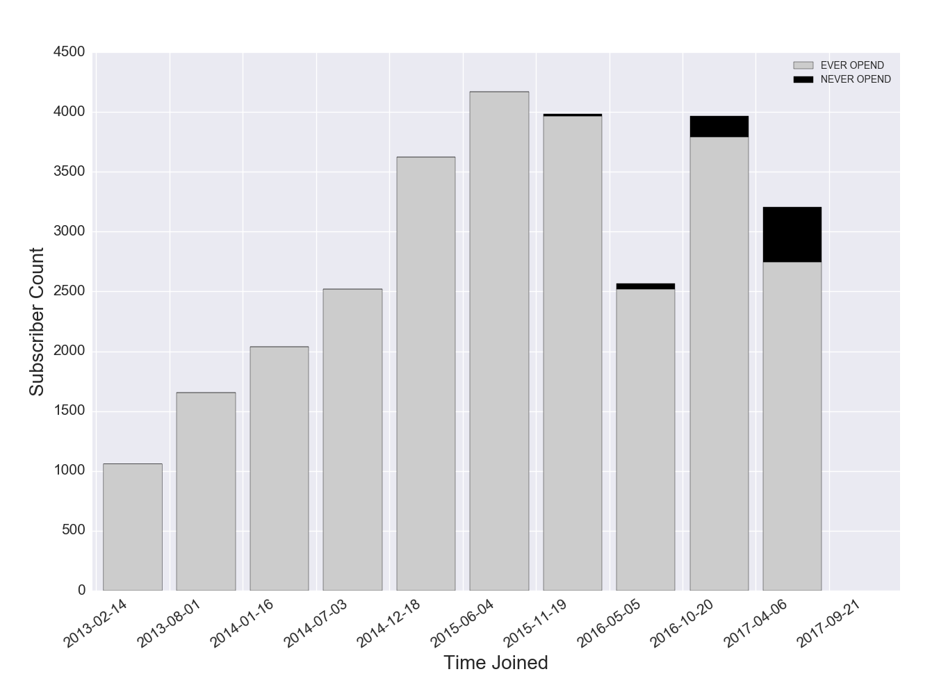
Figure 3a. Stacked Histogram: Ever Opened vs. Never Opened by Joined Time, Inactive Subscribers are New
Figure 3a Discussion: The results for this list show that inactive subscribers have recently joined the list, and that these inactive subscribers are a relatively small portion of the list. It is likely that older inactive subscribers intentionally unsubscribed, were unsubscribed by the list owner, or were cleaned from the list. There is some debate over how long inactive subscribers should remain on the list before removal. In general, removing inactive subscribers after six months will help make your analytics easier to interpret. Re-engagement campaigns should be run to move inactive subscribers toward greater engagement, and the proportion of inactive subscribers on your list should be monitored regularly.
Figure 3b. Stacked Histogram: Ever Opened vs. Never Opened by Joined Time, Inactive Subscribers are New but the Majority
Figure 3b Discussion: This example shows a list that is a little over a year old and has a majority of inactive subscribers. If inactive subscribers are not suppressed, it will be difficult to assess what is working. Without a purging of inactive subscribers, this list is headed for trouble. Possible implications include:
[4] If your email service provider cannot show this kind of behavior, by pulling the raw data you have the tools to run more accurate campaign reports and can even automate this process to report by various segments (perhaps even paid, unpaid, time on site, etc). You can also run the notebook on a server and automatically remove inactive subscribers after a certain period of time, although this requires that your email service provider have an effective API.
Is most of your list deeply engaged with your content, or does a tiny minority represent most of the list activity? Typically, current subscriber lists or email campaign summary statistics are reported for open and click rates. Looking at the distribution of individual user open and click rates provides another vantage point for these familiar metrics of audience engagement. MailChimp calculates “user average open rate” and “user average click rate” as follows:


To be clear, these are unique open and click rates, although not labeled as such by MailChimp. For clarity from now on we will refer to “user average open rate” as “user unique open rate” and “user average click rate” as “user unique click rate.”
The process of making a histogram involves binning, which groups together consecutive continuous numbers into discrete bins. The x axis shows the range that each bin contains. As an example, the leftmost bin, which spans from 0 to 0.1, displays the number of subscribers with a user unique open rate between 0% and 10%. The rightmost bin displays the number of subscribers with a user unique open rate between 90% and 100%. The y axis shows the number of current subscribers who fall into each bin, labeled as “Subscriber Count.”
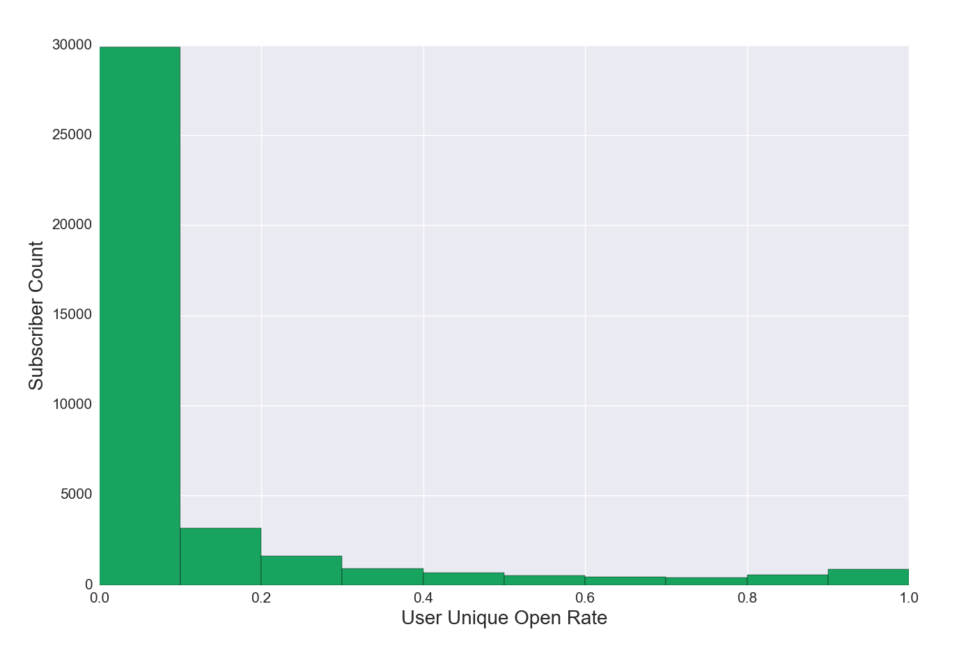
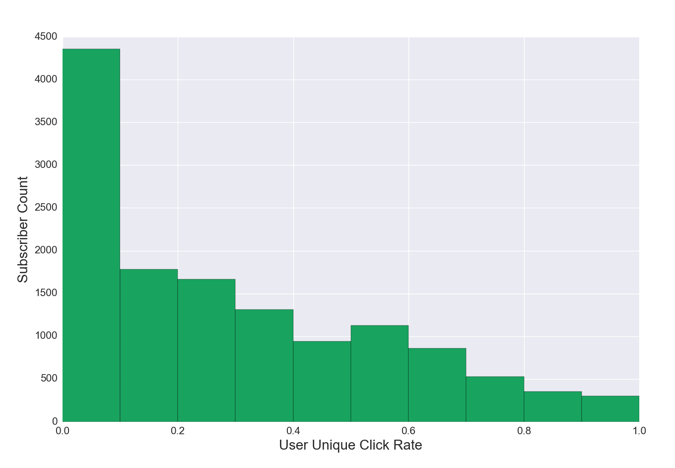
Figure 4a. Unique Open Rate Distribution for Subscribers, Regular List
Figure 4a Discussion: This example shows a list where about a third of subscribers have opened between 0% and 10% of emails received. The remainder of the list is more engaged, and a small portion has opened between 80% and 100% of emails received. These subscribers are your biggest fans and deserve greater scrutiny—what drives their behavior? Is there a way to move more subscribers to greater engagement?
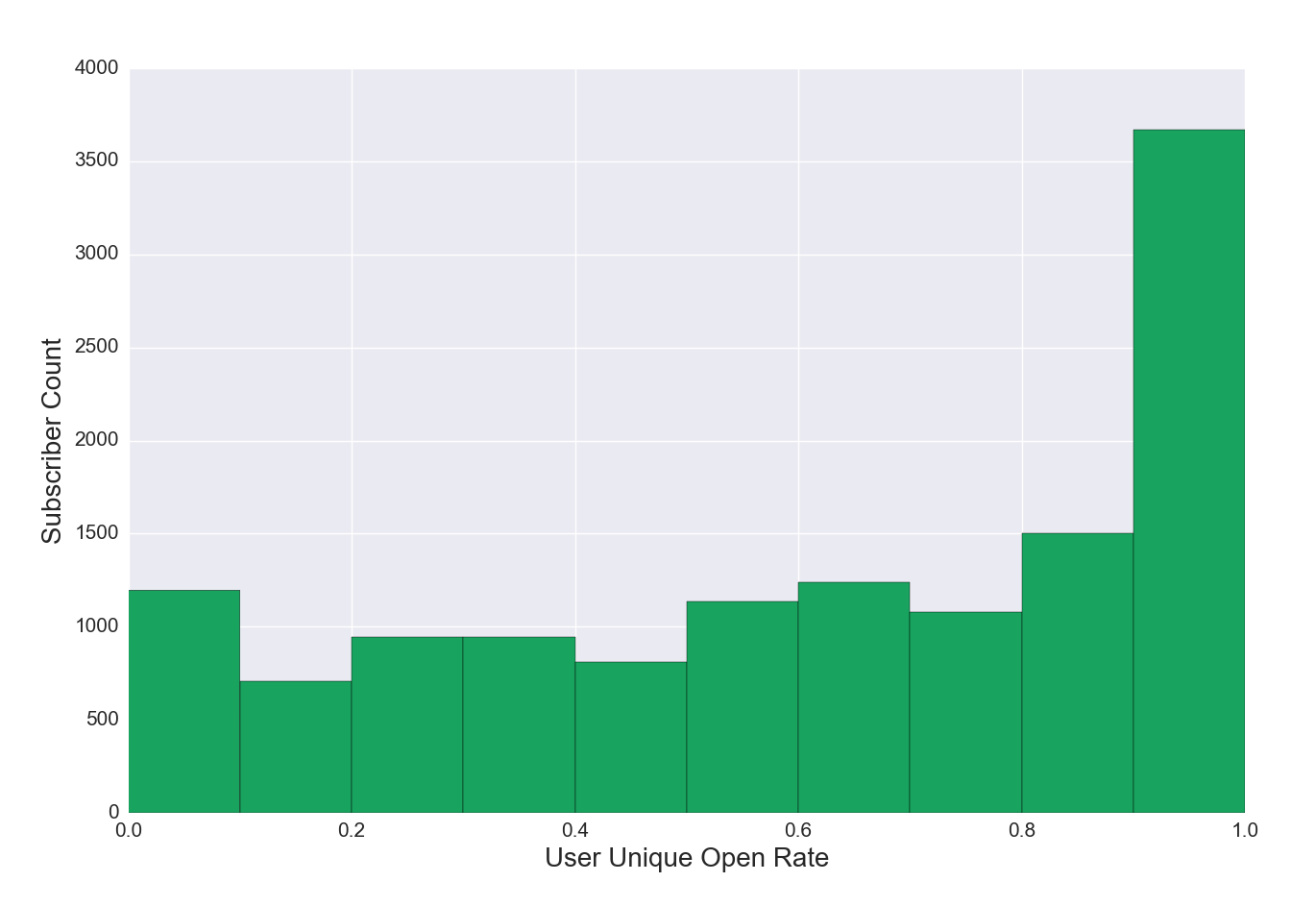
Figure 4b. Unique Open Rate Distribution for Subscribers, Very Engaged List
Figure 4b Discussion: This example shows a list where many subscribers open 80-100% of all emails received, representing an extremely engaged audience. The shape of this visualization is not typical, but is not out of reach and represents something to aspire to.
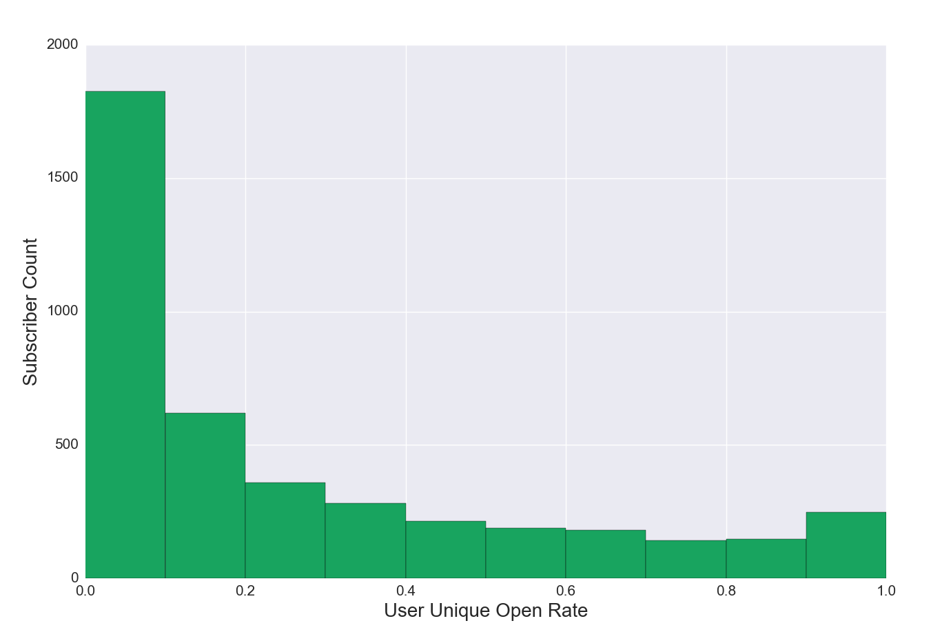
Figure 4c. Unique Open Rate Distribution for Subscribers, Struggling List
Figure 4c Discussion: In Figure 4a, user unique open rate bins taper somewhat gradually left to right. The list in Figure 4c has a high number of relatively inactive subscribers (0%-10% unique open rate), and a low number of current subscribers with user unique open rates greater than 10%. This list has a relative scarcity of readers who open more than one in ten emails and is likely to experience analytics and deliverability issues if not remedied.
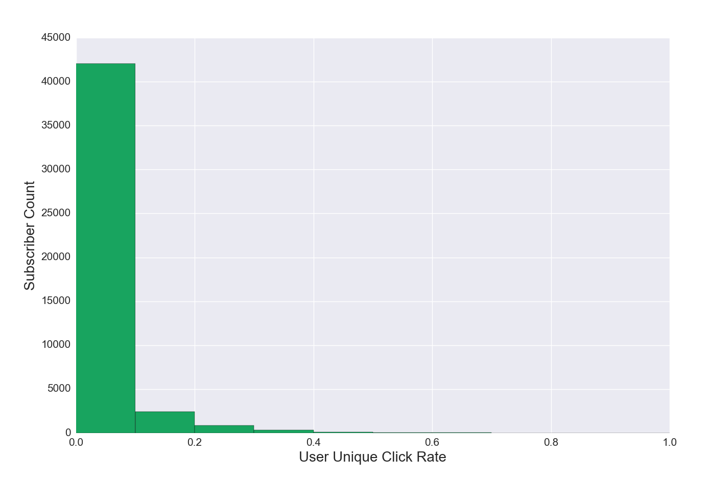
Figure 4d. Unique Click Rate Distribution for Subscribers, Regular List
Figure 4d Discussion. Click rate is not always a useful measure of engagement. Some editorial products are designed simply to be read, not to drive traffic or click behavior. Click rates can provide useful data on audience interest, or add a measure of engagement—a high volume of clicks towards the end of an email indicates deep user engagement. The example in this visualization may seem low because of the dramatic drop-off in the click rate, but given the equation (user unique click rate = number of unique clicks / number of emails received) this distribution will be common.
Figure 4e. Unique Click Rate Distribution for Subscribers, Very Engaged List
Figure 4e Discussion: This example shows a list with a very high rate of engagement, where users click on many links in many emails. Design and purpose of the editorial product, as well as user engagement levels, will shape the distribution on this graph.
Subscriber churn tempers the growth of your email list. Churn refers to the percentage of subscribers who are removed as subscribers over a given period of time (also see Figure 1b discussion). There are many ways of looking at subscriber churn. One approach is to examine the lifetime of the list. For every 100 subscribers who successfully joined the list:
where s, u, and c are the number of users expected in each state.
Lifetime subscribed, unsubscribed and cleaned rates help paint a high level picture of churn and subscriber retention.
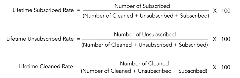
Preliminary research indicates for mature lists (older than a year), commonly observed results were as follows:
*As previously discussed, older lists have a greater likelihood of having more cleaned email addresses accumulate. For a list younger than 3-4 years, all lifetime cleaned rates observed in our sample were less than 10%. Lists older than 5 years may have higher cleaned rates, between 10-15%. Churn is further examined at the individual level in Notebook 2.
Notebook 1 looked at the list as a whole, whereas Notebook 2 looks at the behavior of individual users on the list. Notebook 2 builds on the initial work in Notebook 1, enriching the data by pulling individual users’ records from the MailChimp API. We use the additional data to create and add more features to the original dataset. While these notebooks are designed to utilize the MailChimp API for the data, that doesn’t have to be the case. If you have another source of information that also has emails of users on your list, such as paying subscriber information, you can use it to enrich your dataset with code very similar to what is included in Notebook 2.
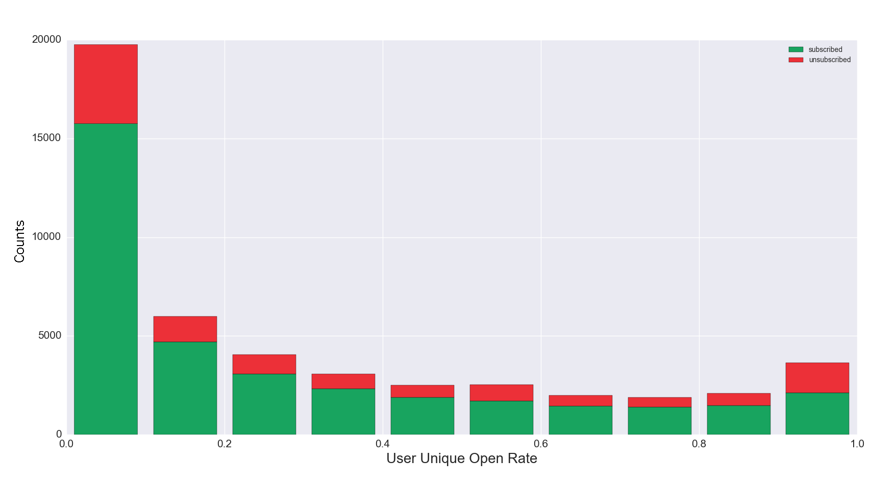
Understanding how to capture and retain audience attention requires deeper insight into the behavior of individuals on your list. Do those who unsubscribed behave differently than those who are currently subscribed? Below, in Figure 5a the x axis represents the user unique open rate, expressed as a fraction. The y axis represents counts of the number of unique email addresses. Figures 5a through 5d are stacked histograms.
Figure 5a. Unique Open Rate Distribution for Subscribed vs. Unsubscribed
Figure 5a Discussion: This example shows a distribution of user unique open rates for current subscribers vs. unsubscribed email addresses. Some unsubscribed users have a unique open rate between 90-100%. These unsubscribed users could open the first email, and unsubscribe, or they could remain on your list for some time, opening the majority of emails, and then unsubscribe. The high unsubscribe rate among the most engaged readers requires more investigation, but is not necessarily rare. Conversely, a high proportion of unsubscribed users who are least engaged, with user unique open rates between 0-10%,[5] is common among lists with good hygiene. Additional investigation would include looking at this data over time. If unsubscribes are clustered together recently, it could indicate a reader reaction to a change in the editorial product.
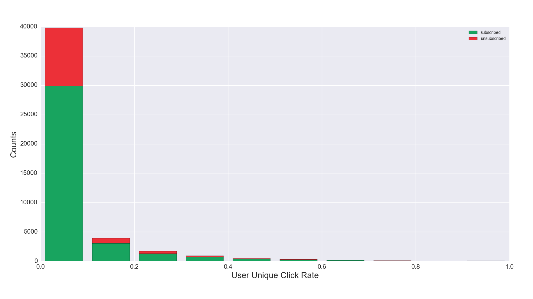
Figure 5b. Unique Click Rate Distribution for Subscribed vs. Unsubscribed
Figure 5b Discussion: The click rate distribution displayed here—with the largest number of subscribers and unsubscribes in the 0-10% click rate range—is common due to the design of the equation (unique clicks / emails received), but may surface anomalies worth investigating.
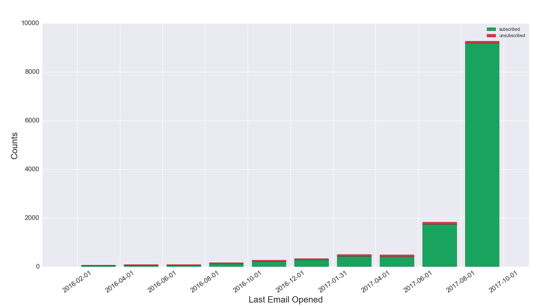
Figure 5c. Latest Email Opened, Subscribed vs. Unsubscribed
Figure 5c Discussion: It is important to note this graph shows on the x axis the date of when the latest email was opened (as opposed to date the email was sent). Larger bars on the right hand side of the graph show significant recent engagement of the list. This example indicates a healthy list with a high volume of recent engagement. If the bars were more evenly distributed across the time horizon, or were larger on the left hand side of the graph, that would indicate a list with shrinking engagement. This graph also includes unsubscribes, although variation in unsubscribe volume can be difficult to see due to the scale of the y axis and relatively small number of unsubscribes.
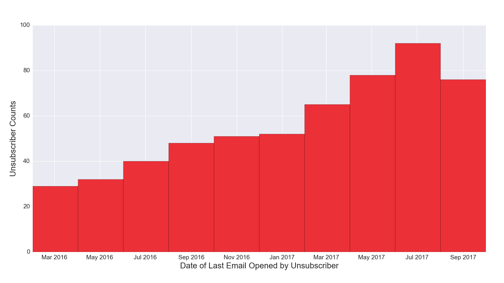
Figure 5d. Latest Email Opened, Unsubscribed
Figure 5d Discussion: This visualization displays data for unsubscribes only, and makes the count on a scale that is easier to read than in Figure 5c.
[5] How can someone who has never opened an email unsubscribe? It’s likely the list owner unsubscribed inactive readers from the list. This process is known as “cleaning” the list, but it is important to note that emails unsubscribed by the list owner as part of the “list cleaning” process show up as unsubscribed, not cleaned.
Carrying inactive email records on your list for months or even years impairs your ability to measure list engagement and build a stronger list. A core function of Notebook 2 is to get a view of user behavior over time. How recently have current subscribers on your list opened an email? What percentage haven’t opened an email in a full twelve months? This section starts off at looking at total numbers of email addresses active (defined as “opened an email”) in the last 12 months, 9 months, 6 months, 3 months, and 1 month. We go deeper on these metrics by visualizing current subscriber data as an overlaid histogram and stacked area graph.
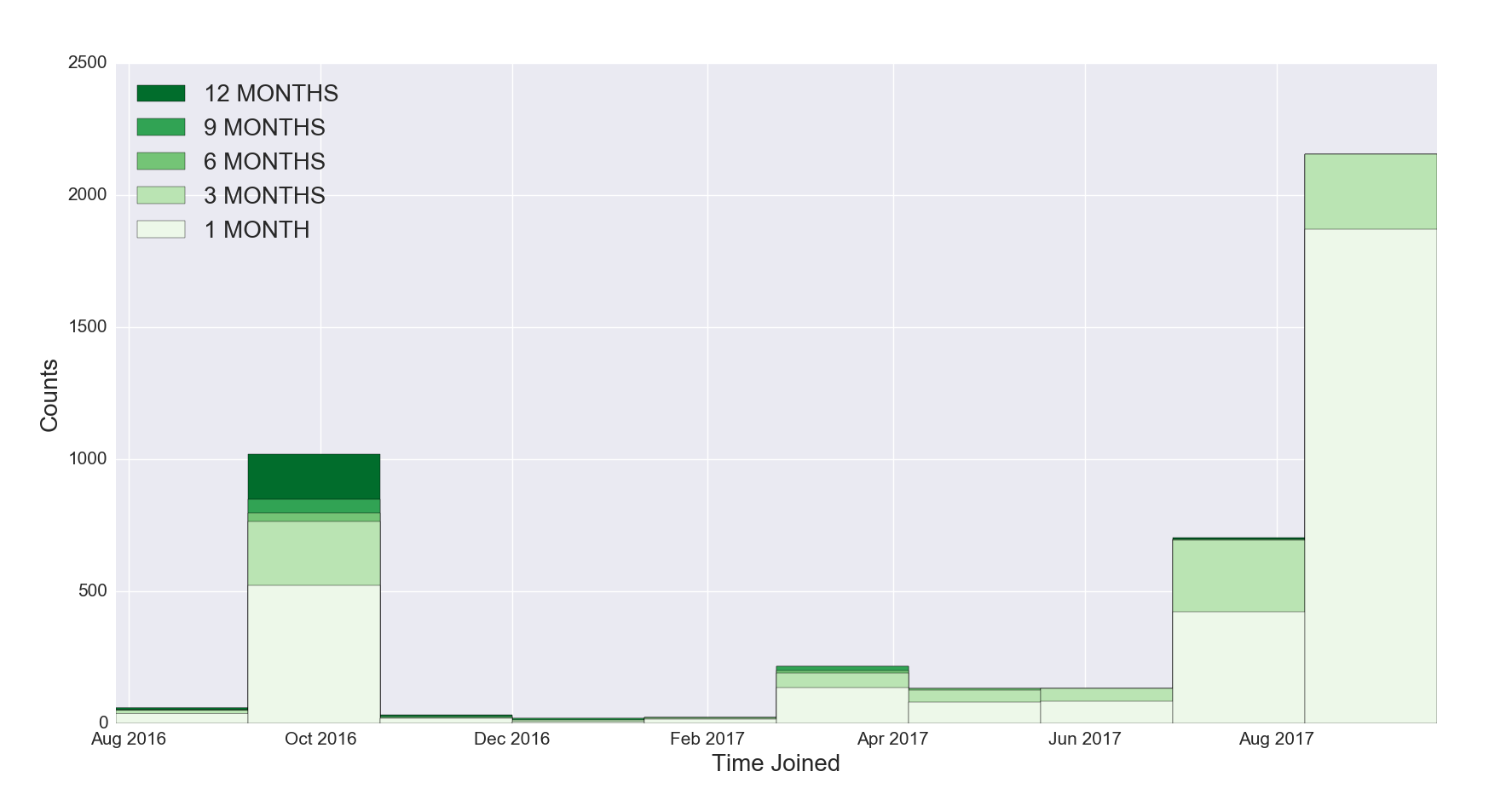
Figure 6a. Overlaid Histogram, Last Active
Figure 6a Discussion: The x axis represents the time the subscriber joined, grouped into 30 day periods, while the y axis represents the subscriber count in absolute terms for subscribers active during the given period. Note that this visualization excludes current subscribers who have not opened any emails in the last 12 months; only current subscribers who have opened an email during the defined timeframe are represented.
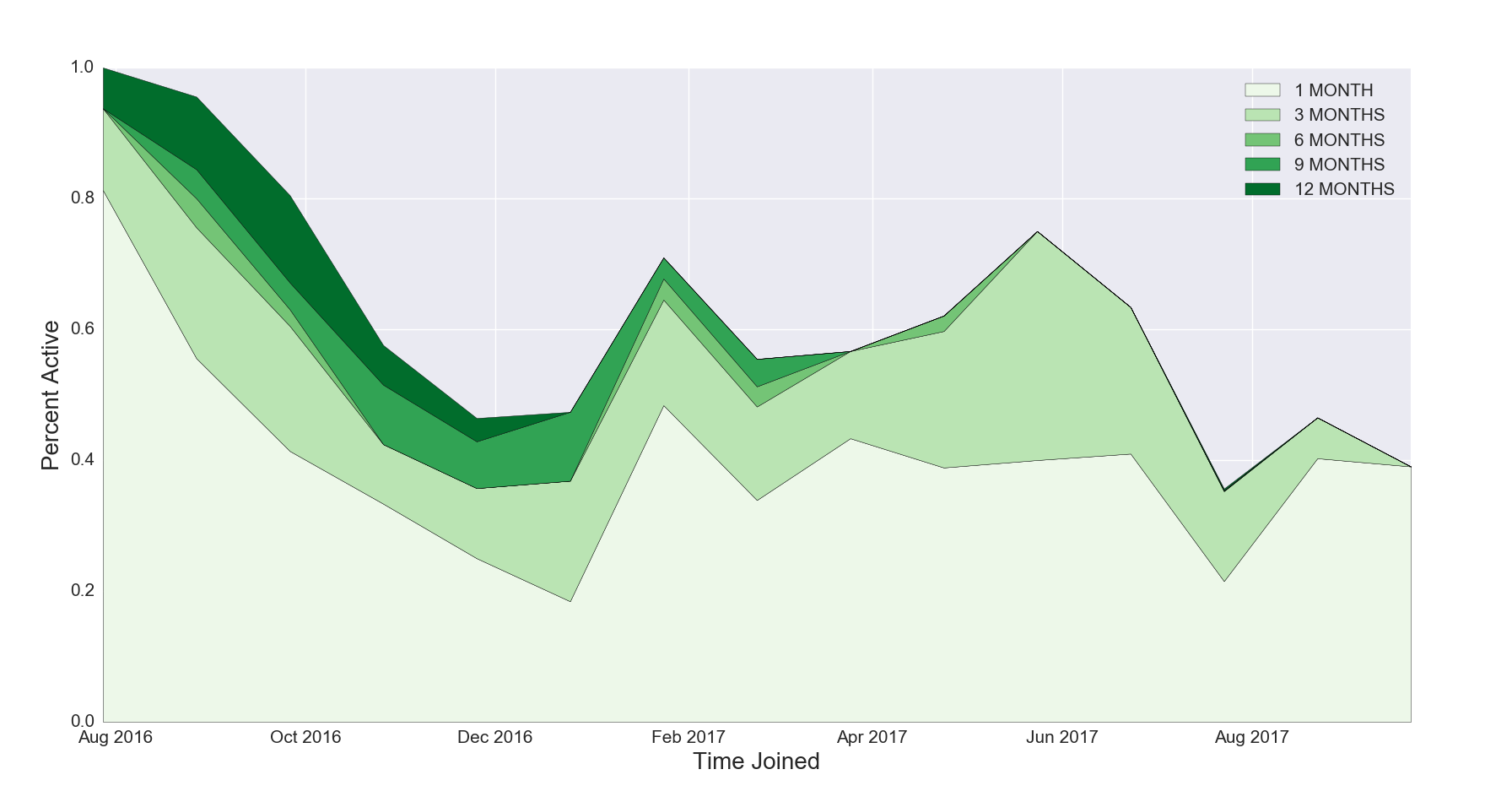
It’s hard to spot trends in the overlaid histogram in Figure 6a given the variations in list growth over different time periods. To better examine trends of how user engagement fluctuates, the next visualization examines the same data by looking at the proportion of everyone who joined during a certain time and segments individuals by the time of their latest email open (12 months, 9 months, 6 months, 3 months, 1 month). The stacked area graph in Figure 6b visualizes the same list data as the overlaid histogram in Figure 6a.
Figure 6b. Stacked Area Graph, Last Active
Figure 6b Discussion: The peaks and valleys in this graph show that some acquisition campaigns yield stronger engagement than others. For example, a higher proportion of current subscribers who joined the list in February 2017 have been active in the last month than current subscribers who joined in August 2017. Furthermore, 80% of all current subscribers acquired in February 2017 have opened an email in the last 12 months, whereas less than 40% of all current subscribers acquired in August 2017 have opened an email.
By looking at the results of the overlaid histogram as well as the stacked area graph you are able to learn new things about your list. The overlaid histogram (Figure 6a) only shows subscribers who have opened, whereas the stacked area graph (Figure 6b) shows the proportion of active and inactive subscribers by time joined for all subscribers currently on your list, making it seem like there are a lot of recent active subscribers. The acquisition in February 2017 is barely visible in the overlaid histogram because a small number of new subscribers joined the list at that time. The stacked area graph reveals February 2017 produced a larger proportion of subscribers active in the last month than all subsequent acquisition campaigns. Examining subscriber activity in this manner can help hone future acquisition campaigns. This exercise can be further sliced and diced by incorporating acquisition source or revenue data if available.
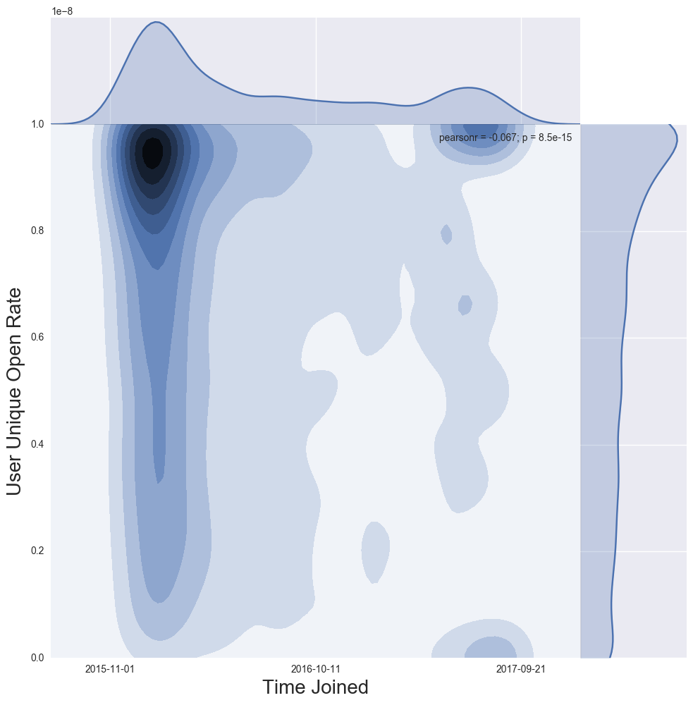
In this section we add complexity to the visualizations by looking at two-dimensional joint distributions. Note each the x and y axis have a corresponding one-dimensional smoothed histogram in the corresponding margin. The joint distribution is displayed as a contour plot in the center. Visualizations are not all from the same list and are meant to help you learn to read the distributions in order to interpret your own results.
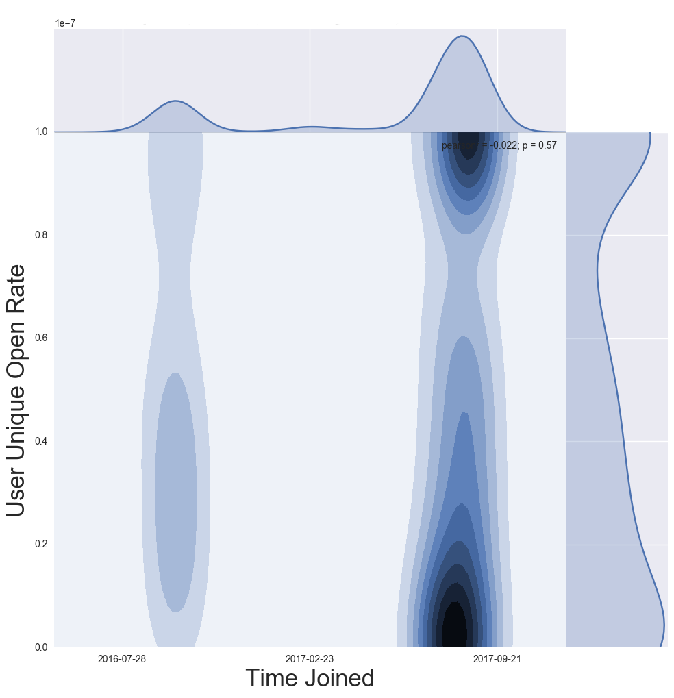
Figure 7a. User Unique Open Rate vs. Time Joined, Current Subscribers
Figure 7b. Explanation of Joint Distribution in Figure 7a
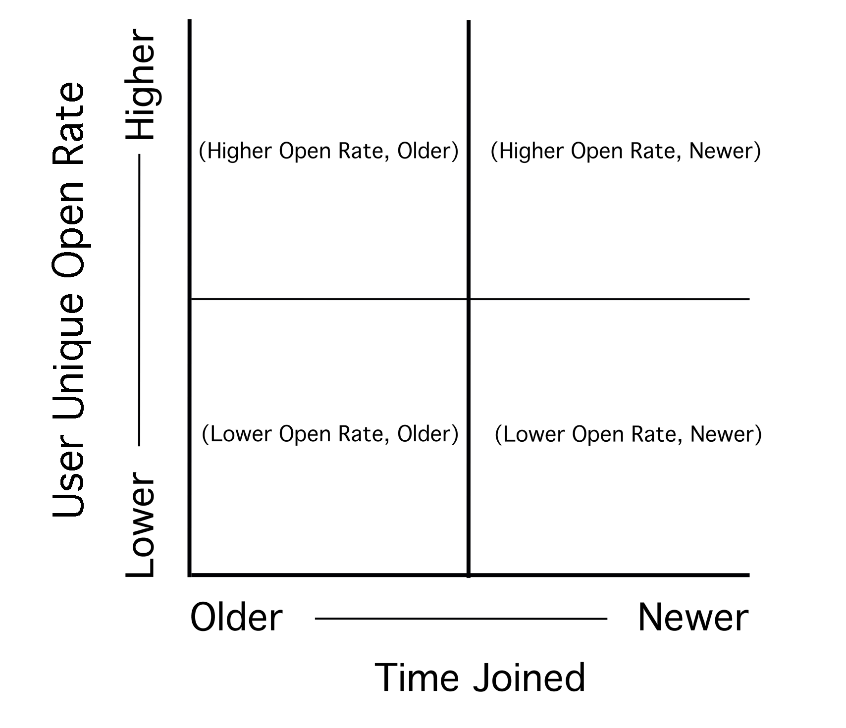
Figure 7a and 7b Discussion: To better understand how to read the joint distribution in Figure 7a (User Unique Open Rate vs. Time Joined) refer to Figure 7b. The example in Figure 7a shows a list with highly engaged subscribers, the majority of whom have been on the list a longer time.
Reading a joint distribution: Start with the x axis, and corresponding one-dimensional smoothed histogram at the top of the visualization, which in this case represents the volume of subscribers by the time each joined the list. The y axis and corresponding one-dimensional smoothed distribution on the right side of the contour plot shows the distribution of user unique open rates. In this case, there is a concentration of current subscribers with open rates between 0.8 and 1.0, or between 80%-100%. Combining data from the x and y axis creates the contour plot in the center; which in Figure 7a shows a concentration of subscribers who have been on the list for a longer period of time, with very high open rates. Newer subscribers have a bimodal distribution.
NOTE: A user unique open rate of 0 can only be achieved if the subscriber has never opened an email. User unique open rate can be pulled up by past opens and does not directly examine if a user has recently opened an email.
Figure 7c. User Unique Open Rate vs. Time Joined, Unsubscribed Users
Figure 7c Discussion: This joint distribution displays data for unsubscribed users and can be read in a similar manner to Figure 7a. In Figure 7c, most unsubscribed users joined the list recently, as seen by the concentration of users on the right. Most unsubscribed users who joined the list longer ago (to the left) in general have user unique open rates below 0.6 or 60%.
NOTE: For new users on the list (on the right), user unique open rate typically falls into a bimodal distribution. New users have received fewer emails so there’s a smaller denominator calculating open rate, making ending up in a bimodal extreme of a very high or very low unique open rate more likely.
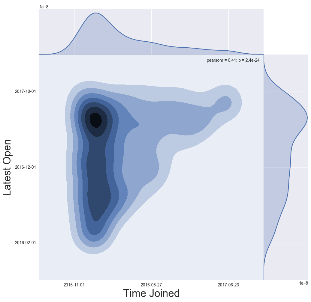
Figure 7d. Time of the Last Email Opened vs. Time Joined, Current Subscribers
Figure 7d Discussion: By visualizing the time current subscribers joined the list vs. the time they last opened an email, we are able to get a sense of whether or not subscribers stay engaged over time, and if older subscribers tend to become less engaged over time. This visualization supplements Figure 7a. In the result shown in Figure 7d, the majority of current subscribers have been on the list a longer period of time (darker concentration on the left). Most opened an email recently (farther up the y axis = more recent open). Although there is a slight falloff of engagement for older subscribers, it is not concerning as most have opened within the last few months.
NOTE: Figure 7d only displays information for current subscribers who have opened at least one email. Current subscribers who have not opened an email are not represented.
Figure 7e. Time of the Last Email Opened vs. Time Joined, Unsubscribed Users
Figure 7e Discussion: This visualization is the same as Figure 7d, except that it displays the latest open for unsubscribed users. Unless the list owner unsubscribed inactive subscribers, the last email opened by an unsubscribed user will be the email the now unsubscribed user opened as a subscriber, before taking the unsubscribe action. Figure 7e shows that a greater number of older users on the list have unsubscribed compared to newer users. The latest email opened by unsubscribed users is distributed over the lifetime of the list, with a greater concentration of latest opens in mid-late 2017. Further investigation is needed to determine the cause of this concentration in unsubscribes.
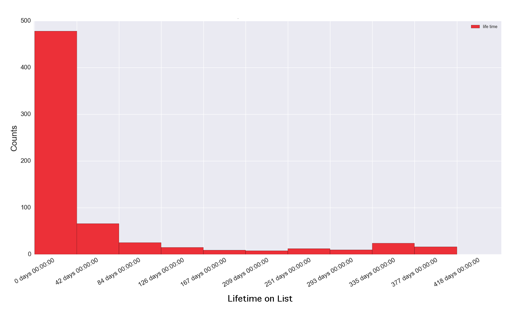
How many days are readers subscribed before unsubscribing? There are a few different ways to investigate churn. One way is to look at the distribution of how long a subscriber was on the list before he/she unsubscribed or was unsubscribed by the list owner. If list owners tag unsubscribes that are part of list cleaning, these users can easily be separated. Figures 7f and 7g are histograms that display the distribution of how long currently unsubscribed users were subscribed. The x axis “Lifetime on List” represents the number of days a user was subscribed before his/her status changed to unsubscribed.
Figure 7f. Churn Distribution, Faster Churn
Figure 7f Discussion: A high peak on the left and sharp decline to the next histogram bar to the right means when currently unsubscribed users were subscribed, they were subscribed for a relatively short period of time. The histogram displays the distribution of time subscribed for all currently subscribed users. In this example, the shortest time was 16 hours while the longest tenure on the list was 400 days.
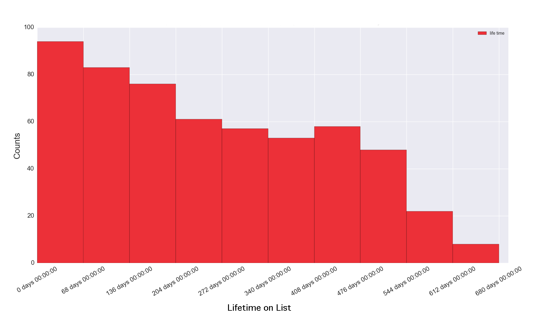
Figure 7g. Churn Distribution, Slower Churn
Figure 7g Discussion: A more gradual decline from one histogram bar to the next (left to right), as shown in Figure 7g, indicates a longer time as a subscriber on the list, or in other words, a slower churn.
It’s not hard to know more about your readers with the data you have today. Are you asking questions about your audience? How are you leveraging your data? The Shorenstein Center Notebooks are a way to help with both, with the hope that information gleaned from email acquisition and larger audience analysis can be used not just to hone an email strategy, but to inform new products, platforms and revenue streams.
The Shorenstein Center Notebooks represent the first step in our call for new reporting standards for email, and for larger audience analysis. The Notebooks mark a change in mindset from accepting pre-determined metrics to exploring and defining more pertinent and relevant measures for modern news media. We do not define new metrics in the notebooks, but demonstrate new basic methods of analysis using data science tools. Further research is needed in the following areas: Delineating peer groups for metric comparison, incorporating additional features related to retention and revenue, and exploring more sophisticated forms of analysis such as hidden Markov models (HMM).
A successful media enterprise needs greater understanding of its audience to thrive. Data science and deeper analysis point the way towards understanding audience and building deeper engagement.
This research is made possible by powerful and free tools supported by the open source community. The open source community has many values that align with journalism: transparency, making access to information democratized, and collaboration. We want to especially thank the individuals who contributed to and supported:
Jupyter notebooks, pandas, and matplolib are all open source tools in python that have been built by the open source community with support from NumFOCUS.org
Many people contributed in various ways to this paper, including Emily Roseman, David Beard and Nik Iubel. Special thanks is due to George Resor for lending his expertise as a data scientist; his time and attention was especially valuable for this project, and he quite generously provided it free of charge.
The authors also would like to thank Wes McKinney, creator of the Python pandas project and author of Python for Data Science, 2nd Edition.
[1] Fagerlund, Charlotte. “Back to the Future- Email Newsletters as a Digital Channel for Journalism.” Polis, London School of Economics, January 25, 2016, 1-16. Accessed June 7, 2017. http://www.lse.ac.uk/media@lse/Polis/documents/Back-to-the-future—Email-Newsletters-as-a-Digital-Channel-for-Journalism.pdf
[2] Doctor, Kenneth. “Our Peggy Lee Moment: Is That All There Is To Reader Revenue” Nieman Labs, September 26, 2017. Accessed September 27, 2017 http://www.niemanlab.org/2017/09/newsonomics-our-peggy-lee-moment-is-that-all-there-is-to-reader-revenue/
[3] Davis, Noah. “Who’s LOLing now?” Traffic Magazine, September 2016, 22.
[4] Telephone interview with Charlotte Fagerlund by author. April 28, 2017.
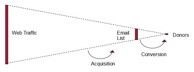
[5] The funnel refers to the below commonly used visual that represents acquisition (web audience to email subscriber) and conversion (email subscriber to donor).
Videos

Commentary

Videos